In the mad, swirling vortex of design, there exists one wild beast of creativity - Tasha Jaeger, an MIT certified design maverick with a feverish grip on 23 years of experience, relentlessly innovating the realm of healthcare, pharma, and life sciences, the chaotic world of B2B/B2C/B2B2C marketplaces, and the pleasures of entertainment.
Steering the design ship at Inspire for a solid seven years, I've been an unyielding force on both B2B and B2C fronts, navigating the treacherous waters of internal tools, dashboards, consumer websites, marketplaces, and apps. As a master of my craft, I can not only conquer any design challenge but also mold the minds of those eager to learn the art.
Fueled by a relentless passion for meaningful work that shapes a better world, I possess exceptional strategic and tactical prowess, bridging the communication gap between departments and driving demonstrable growth. As a design guru, I infuse design thinking and human-centered principles into the very core of teams, leading them through the exhilarating dance of design sprints, all the while honing in on crafting products that sing to the souls of users.
Anticipating and nullifying problems is my game, and remote work is my domain. As a seasoned veteran in managing global teams, I ensure open communication and an environment where my creative minions feel secure to conjure their finest work. Through the fever dream of a best-in-class app, I've shattered the conventional norms of health design, and I've healped redefine the experience of purchasing by weight. As both an individual powerhouse and head of design, I've continuously poked and prodded the limits of design and technology.
When I momentarily escape the whirlwind of design, my free-spirited nature finds solace in advocating for the misunderstood souls with autoimmune diseases and autism, while dabbling in the alchemy of art, culinary adventures, reveling with my offspring, globe-trotting, literary escapades, cinematic odysseys, savoring the nectar of the gods, leather-working, and a myriad of other creative exploits.
In the savage realm of design, where chaos and order collide, I stand as a fearless leader, coach, and mentor. Steering my team, reports, and executives through the twisted labyrinth of design thinking, design sprints, and human-centered design, I conjure rapid results that strike a chord with users and other curious beings lurking in the shadows.
My approach to design is a wild, shape-shifting beast, adapting and contorting itself to the peculiar whims of each bizarre project that dares to cross my path.
With a track record bathed in the blood, sweat, and tears of effective design project management, I am a master puppeteer, pulling the strings of in-house designers and contractors to conjure the most mesmerizing results. Forever racing to stay ahead of the relentless design curve, I devour trends, tools, and implementations, ensuring my team conjures high-quality, mind-bending designs that leave the world gasping for breath.
I led the collaboration between the stakeholders and the contract agency selected to develop the brand, messaging, and core visuals. During our initial meetings, I facilitated discussions on the company's current branding and identified the goals we were striving to achieve.
Throughout the brand redevelopment process, I maintained close collaboration with the contract agency to ensure the design accurately represented the company's vision. Through a series of meetings and constant communication, I provided critical feedback on the visuals, guiding the development of the brand to meet the desired outcomes. My dedicated involvement in the process allowed us to refine the visuals until they truly embodied the essence of Inspire.
The contract agency delivered a comprehensive visual identity package to me. This package included a new logo, logo standards, a foundational color palette, and initial visual concepts.
I was responsible for taking the visual ID provided by the agency and elevating it to meet the needs of the company. I expanded the color palette to ensure it would be suitable for use across a range of applications, including the company's website and app....
...I also created a variety of basic templates, such as slide templates, to ensure that the company would consistently produce high-quality presentations.
As I developed and oversaw the creation of new design elements, I simultaneously created clear and comprehensive guidelines to govern their use.
I utilized the design guidelines I had created to develop the official visual brand guidelines for Inspire. These guidelines established a consistent standard for the use of the design elements and ensured their proper implementation across all company communications and materials.
Additionally, I leveraged the guidelines to create training materials for all employees, ensuring that everyone had a clear understanding of how to correctly apply the design elements in their work. This helped to foster a shared understanding of the brand and its visual identity, further strengthening the company's position in the market.
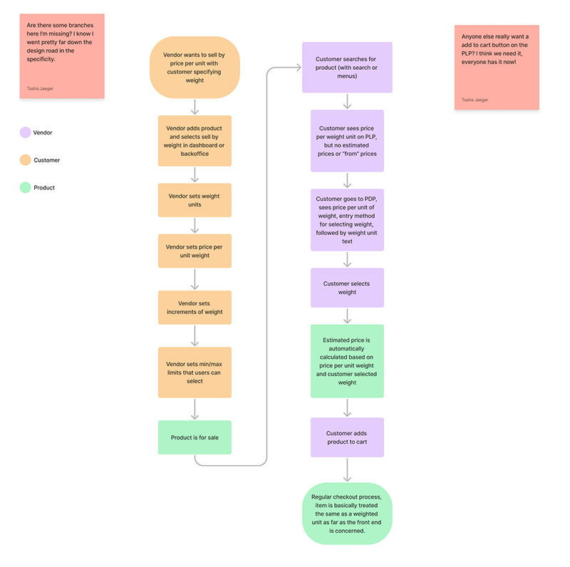
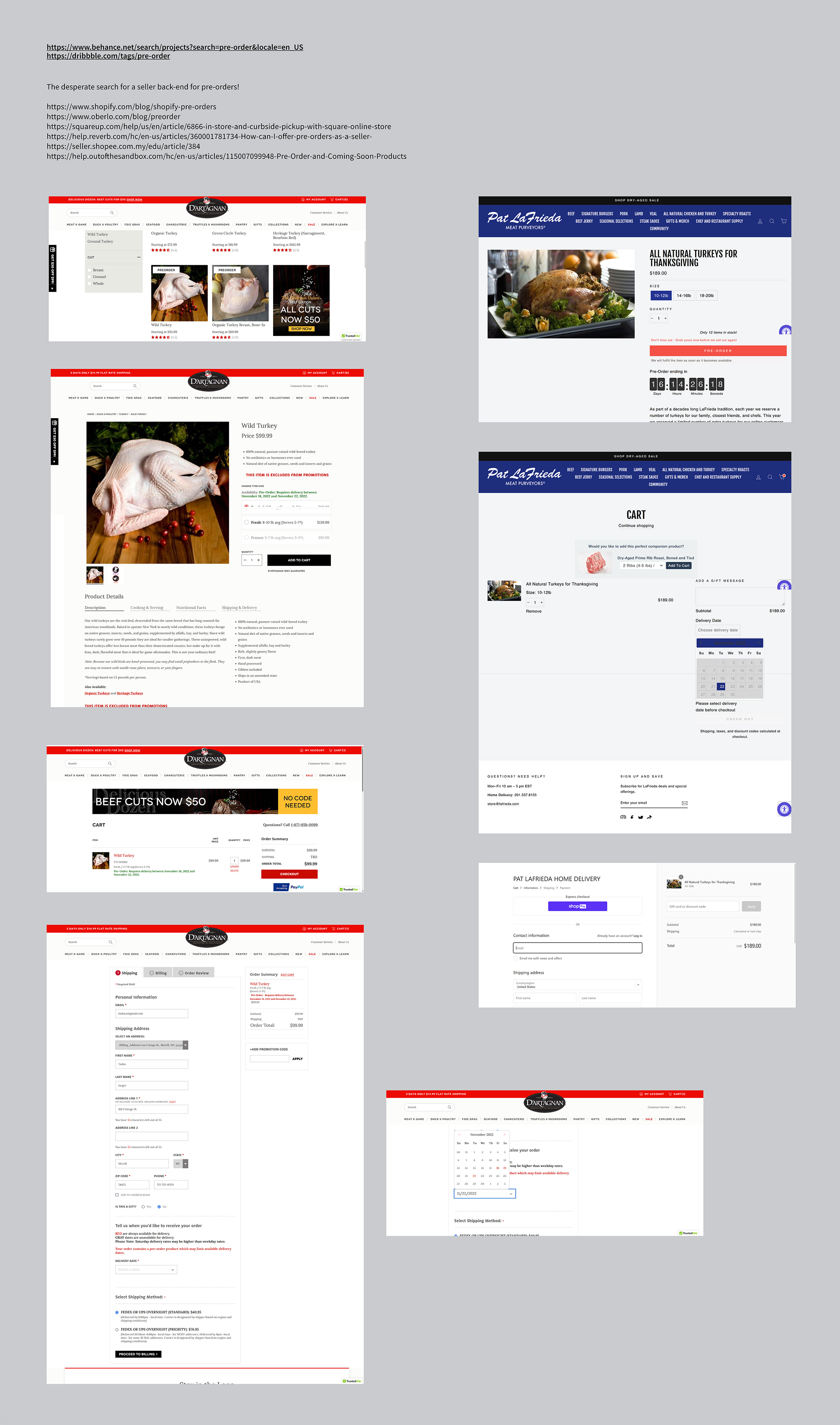
Selling items by weight
Company: Promenade | Project: Sell By Weight | 2022-2023
My Role: Lead Designer, UX Research
Summary: This project revolutionized e-commerce for weight-based products by developing a groundbreaking solution that allowed customers to choose their desired product weight and view corresponding prices. The result was enhanced customer satisfaction, increased sales opportunities, and improved inventory management for vendors.
The Challenge
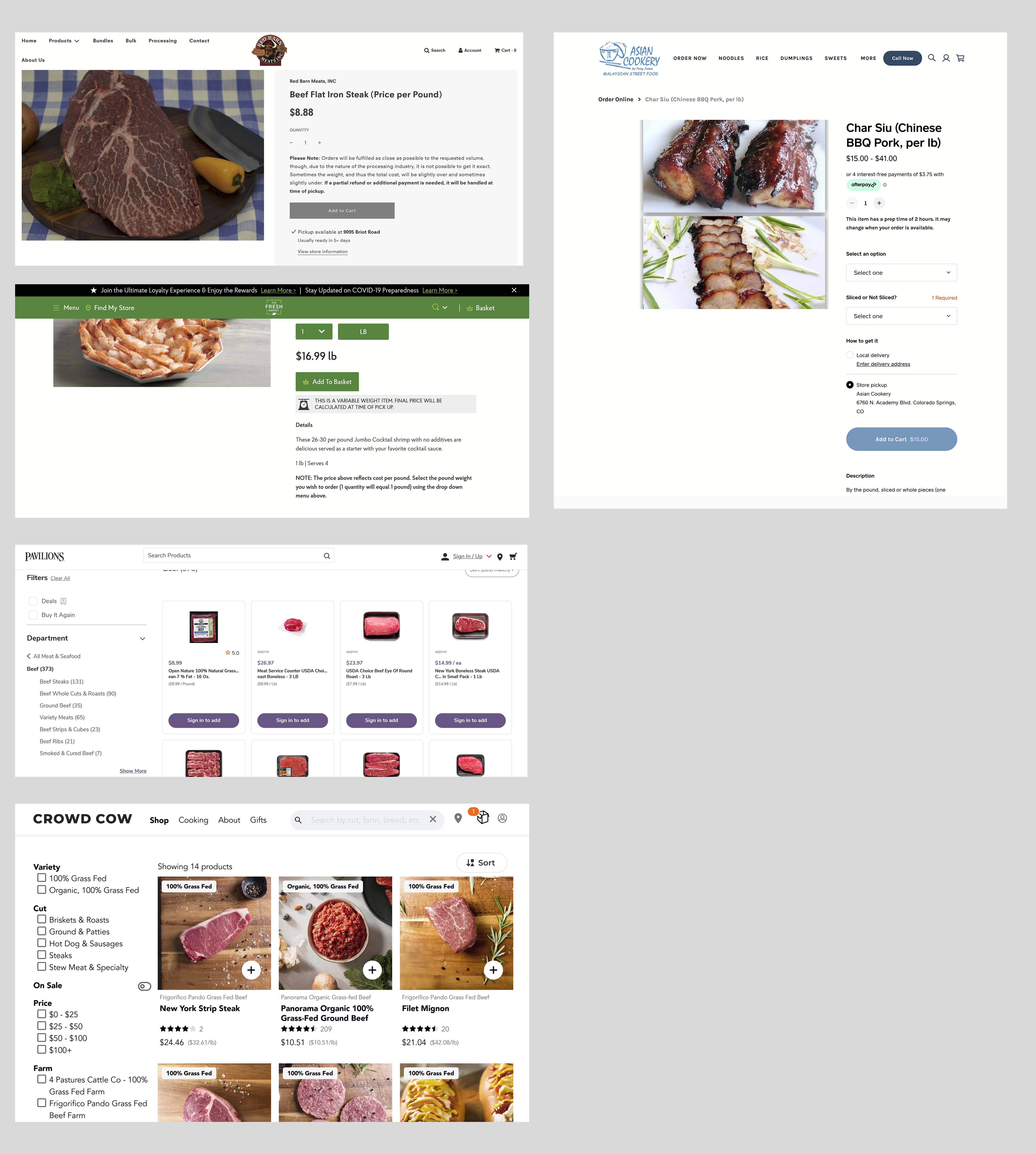
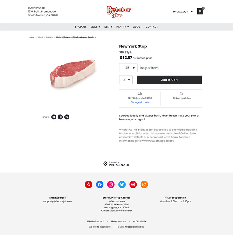
In the world of e-commerce, platforms have long catered to selling products in fixed quantities or units. However, for items like meat, cheese, or bulk foods, customers often prefer purchasing based on specific weights. Conventional e-commerce platforms failed to accommodate this preference, resulting in an unsatisfactory shopping experience for customers and lost sales opportunities for vendors.
Existing solutions provided only pre-determined weights with fixed prices, which failed to offer customers the flexibility to choose their desired weight and see the corresponding price per weight unit. This limitation posed several challenges:
Customer dissatisfaction: Customers were unable to purchase the exact amount of product they needed, leading to potential waste or a reluctance to buy.
Vendor constraints: Vendors were restricted in their ability to sell their products in a manner that aligned with their customers' needs and preferences. This negatively impacted their sales and customer satisfaction.
Limited product offerings: As the e-commerce platforms did not provide support for selling items by weight, vendors were forced to rely on less accurate and less convenient alternatives, such as pre-packaged items.
Inefficient inventory management: With the inability to sell products by weight, vendors had to manage their inventory in fixed increments, which could lead to an inefficient use of storage space and increased waste.
These challenges combined to create a significant gap in the e-commerce market for weight-based products, necessitating a solution that would address the unique needs of both customers and vendors.
My Solution
To address the challenges faced by vendors and customers in the e-commerce market for weight-based products, I devised a comprehensive solution that took into account the requirements of all stakeholders involved. The solution was comprised of several key components:
In-depth research: I conducted thorough interviews with butchers in the industry to gain valuable insights into their needs, preferences, and pain points. This research informed the design process, ensuring that the solution would meet the specific requirements of both vendors and customers.
Competitive analysis: By analyzing existing e-commerce platforms and solutions, I identified the gaps in the market and the features that were essential for a successful weight-based product solution.
Customizable workflow: I designed a user-centric workflow that catered to the unique needs of selling products by weight. This workflow allowed vendors to easily manage their inventory, set prices per weight unit, and offer customers the flexibility to choose their desired product weight.
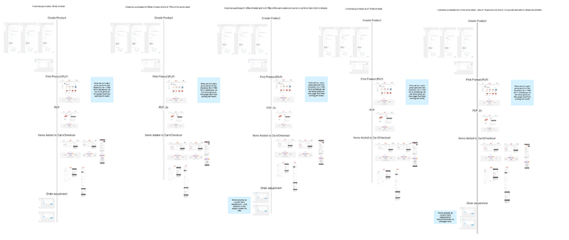
Iterative design process: Through collaboration with the product manager and other stakeholders, I refined the workflow based on feedback and developed detailed wireframes and designs. This iterative process ensured that the solution was optimized for usability, efficiency, and aesthetics.
Comprehensive user paths: I created full user paths for both vendors and customers, detailing each step of their respective journeys. This facilitated clear communication of the vision to all stakeholders and provided engineers with a robust blueprint for implementation.
Edge case identification: To ensure the solution was versatile and adaptable, I thoroughly brainstormed potential edge cases and incorporated them into the design process. This allowed the solution to accommodate various scenarios, resulting in a more robust and resilient system.
By addressing the unique needs of vendors and customers in the weight-based product market, this innovative solution promises to revolutionize the e-commerce landscape, improving the shopping experience for customers and increasing sales opportunities for vendors.
The Results
The innovative weight-based e-commerce solution had a significant impact on various aspects of the shopping experience for both customers and vendors, resulting in several noteworthy outcomes:
Enhanced customer satisfaction: With the flexibility to choose their desired product weight and view the corresponding price per weight unit, customers enjoyed a more personalized shopping experience. This increased satisfaction led to higher conversion rates and the potential for repeat business.
Increased sales opportunities: By offering products based on weight, vendors were able to better align with customer preferences and needs. This new sales approach helped vendors reach a wider audience and capitalize on previously untapped market segments.
Streamlined inventory management: The solution enabled vendors to manage their inventory more efficiently by allowing them to sell products by weight, reducing storage space requirements and waste. This, in turn, led to cost savings and improved resource utilization.
Positive industry reception: The testing phase garnered overwhelmingly positive feedback from butchers, cheese sellers, and other industry professionals. Their enthusiasm for the solution validated the market need for a weight-based e-commerce platform and highlighted the potential for widespread adoption.
Scalable implementation: With the successful testing phase completed, the solution is currently being implemented across various platforms and vendor types. Its modular design and robust framework ensure that it can be easily adapted to accommodate the unique requirements of different industries and products.
Competitive advantage: The introduction of this groundbreaking e-commerce solution for weight-based products has positioned the platform as an industry leader, setting a new standard for user-centric design and functionality. This competitive advantage is expected to drive further growth and market share expansion.
Overall, the results of the weight-based e-commerce solution have demonstrated its potential to transform the shopping experience for customers and vendors alike, while addressing a significant gap in the market. As implementation continues, the solution is poised to revolutionize the e-commerce landscape for weight-based products and create a new benchmark for user-focused design.
Inspire.com design thinking and human-based design training
Company: Inspire | Project: Design Thinking Company-Wide Training | 2021
My Role: Training creation and implementation
Summary: I facilitated a comprehensive training program on design thinking and human-centered design, sharing my knowledge and expertise with the entire company. The program aimed to elevate their design skills, improve collaboration across departments, and foster a user-centric approach to design.
The Challenge
Inspire, a forward-thinking organization, was grappling with a crucial issue that many companies face – a lack of effective decision-making tools and strategies. While boasting a team of skilled designers and a robust design process, the company's broader organization struggled to make well-informed decisions about visual design, product design, and processes in a timely and efficient manner. This challenge often led to delays in product development and missed opportunities for innovation.
The company recognized that to stay competitive, they needed a solution to streamline the decision-making process, promote interdepartmental collaboration, and elevate the overall quality of their design work. They sought to create a company culture that embraced design thinking and human-centered design principles as a means to drive innovation and create products that genuinely resonate with users.
My solution
Leveraging my background in design thinking and leadership from MIT Sloan, I was well-equipped to deliver a comprehensive training solution for Inspire.com. I combined my knowledge and research with my copywriting and illustration skills to create a dynamic and engaging two-hour training presentation designed to help the company unlock its full potential.
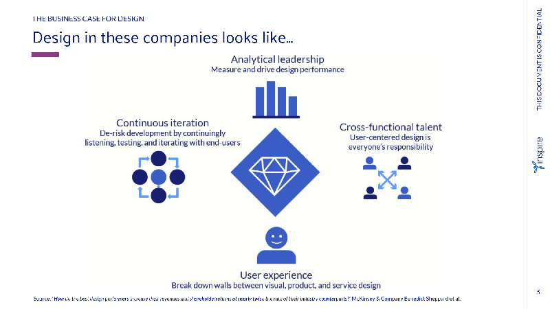
The presentation began by making a compelling case for the business value of design. It showcased how companies that prioritize design tend to be more profitable and demonstrated how these principles could be applied to Inspire.com.
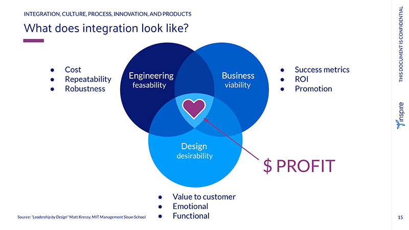
Next, the presentation delved into the key elements of design thinking - integration, culture, process, innovation, and products. I explained how these elements work synergistically to drive innovation and create products that effectively meet users' needs.
At the core of the presentation was a thorough examination of the design process itself. I guided the team through each stage of the process - Exploration, Expression, Creation, and Testing - elucidating how these steps build leadership capabilities, encourage collaboration, and drive results.
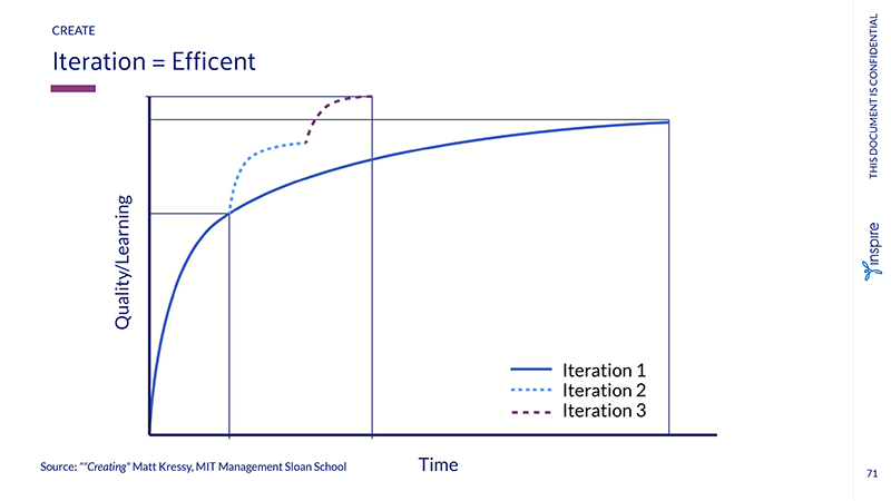
I placed significant emphasis on the importance of iteration and testing, demonstrating how these practices lead to faster development cycles and improved products. Furthermore, I highlighted the necessity for everyone on the project team to participate in the design process, fostering a culture of excitement, innovation, and shared ownership.
The Results
The training program was met with resounding success, providing valuable new tools and insights to the entire Inspire.com team. As a result, the company experienced shorter development cycles, increased collaboration between departments, and a renewed focus on delivering innovative products that cater to users' needs.
The training empowered the team to think creatively, work together, and strive to achieve their goals, and the results were evident. The organization saw a marked improvement in decision-making, product development, and overall design quality, positioning Inspire.com for continued success in the competitive market. See the whole deck here.
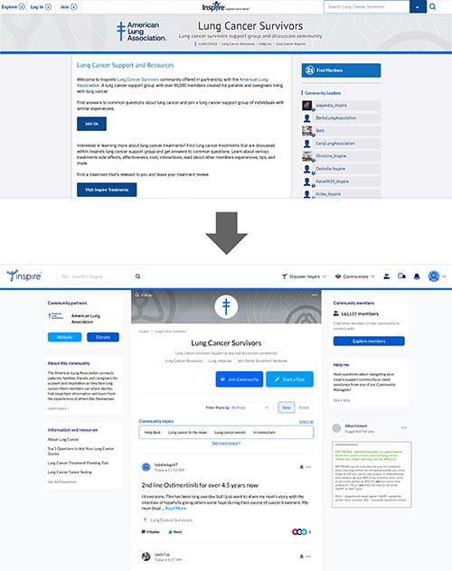
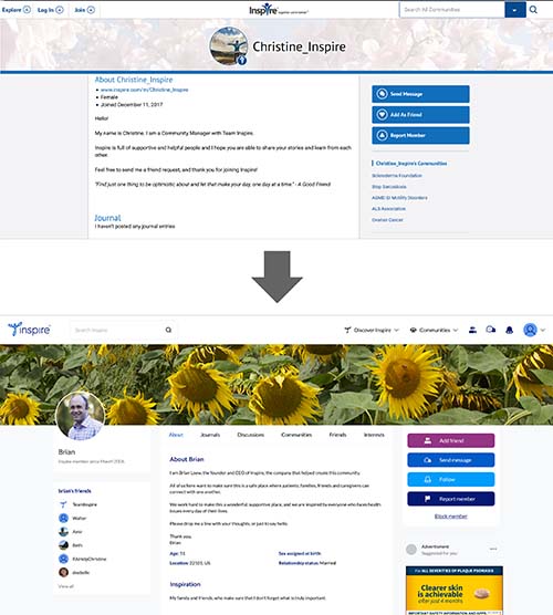
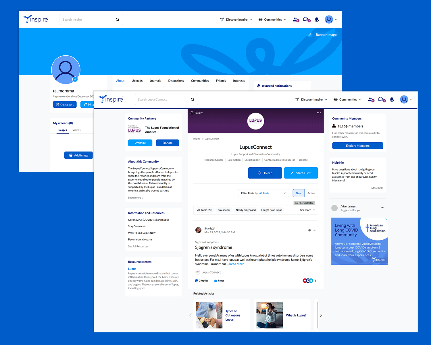
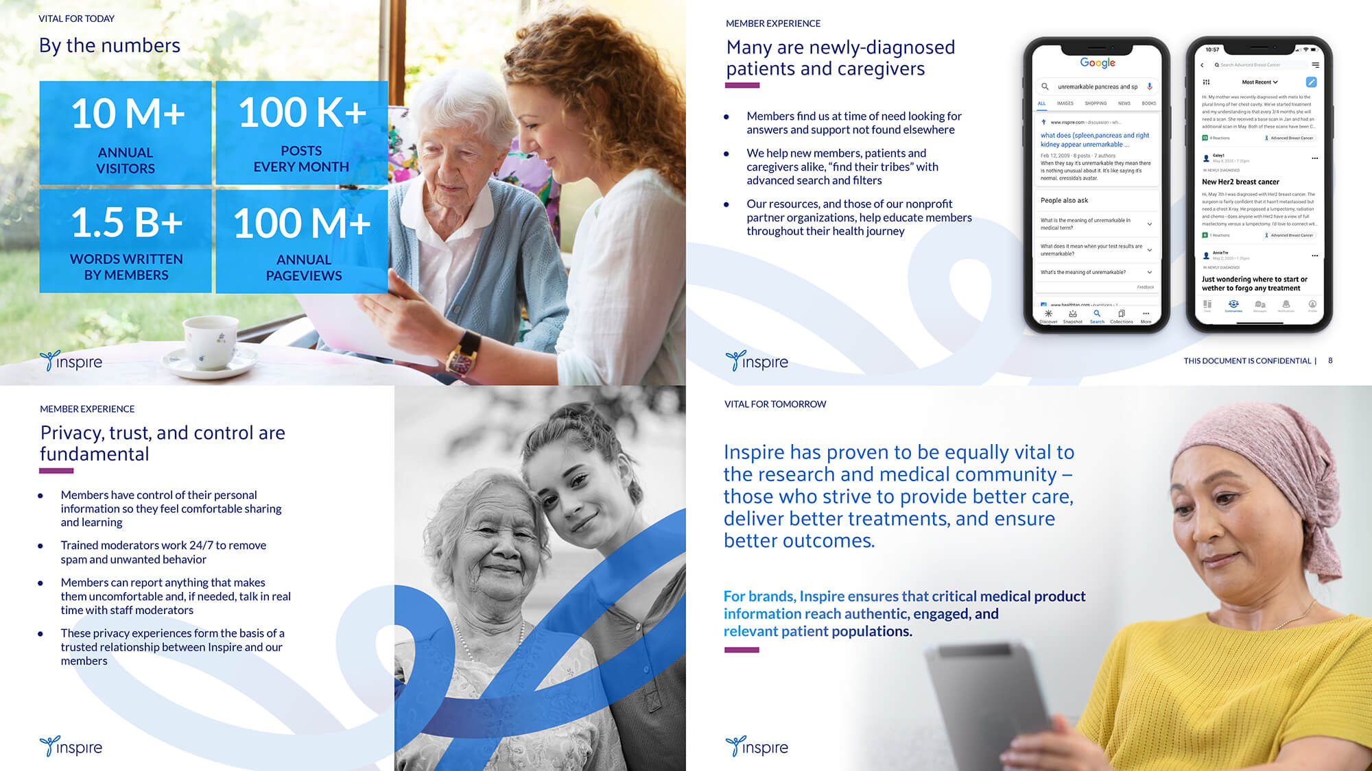
Summary: The Inspire.com website underwent a transformative redesign, leveraging a user-centered approach, user feedback, and design thinking principles. The result was a contemporary, user-friendly website that established the groundwork for ongoing expansion and innovation.
The Challenge
The dated design of Inspire.com posed several challenges that needed to be addressed to ensure the platform's continued success and relevance in an increasingly competitive landscape. Some of the key challenges included:
User dissatisfaction: The website's outdated design and limited functionality led to user dissatisfaction, making it difficult for Inspire.com to retain its existing user base and attract new users.
Inefficient navigation: The site's structure and navigation were not optimized for usability, causing users to struggle when trying to find relevant information or access desired features. This frustration further amplified user dissatisfaction.
Inconsistency in branding: The existing design lacked consistency in branding, which made it difficult for users to form a strong connection with Inspire.com and hindered the company's ability to establish a distinctive identity in the market.
Limited scalability: The antiquated design constrained the platform's potential for scalability and adaptability. As a result, it was increasingly challenging for Inspire.com to accommodate new features and enhancements that could cater to the evolving needs of users.
Technological obsolescence: The website's underlying technology was becoming increasingly outdated, leading to performance issues and limiting the possibilities for implementing modern design techniques and integrations.
To overcome these challenges, it was vital to embark on a comprehensive website modernization journey that would not only address the immediate issues but also establish a foundation for future growth and innovation.
The Solution
To tackle the challenges presented by Inspire.com's outdated design and structure, we devised a multi-faceted solution that encompassed various aspects of the redesign process:
User research and feedback: To better understand user needs, our UX researcher conducted in-depth user interviews, identifying pain points and gathering invaluable feedback. This insight allowed us to tailor the redesign process, ensuring that the revamped website would effectively address user concerns and demands.
Design system and component library: By establishing a solid foundation for the new brand in Figma, we created a design system that promoted consistency across the website. Our UI designer and I developed a library of reusable components, facilitating a cohesive and efficient design process.
Collaboration between UX and UI designers: Our UX/UI design team divided their focus to optimize our impact, with one designer specializing in UX and the other in UI. This strategic approach enabled us to produce exceptional work that catered to both functional and aesthetic aspects of the project.
Design thinking and iterative improvement: Adhering to design thinking as laid out in the training deck I created, we approached each aspect of the project with empathy, experimentation, and iterative refinement. This methodology helped us deliver a user-centered design that adapted to user needs and expectations.
Technological upgrades: To address technological obsolescence, we updated the website's underlying technology, improving performance and enabling the implementation of modern design techniques and integrations.
Improved navigation and usability: We revamped the site's structure and navigation, optimizing it for usability and ensuring that users could efficiently find relevant information and access desired features. This improvement significantly reduced user frustration and increased satisfaction.
Consistent branding: The redesigned website featured a consistent brand identity, fostering a strong connection between users and Inspire.com, and distinguishing the company in the market.
Scalability and adaptability: By creating a modular, flexible design, we laid the groundwork for easy scalability and adaptability. This foundation allows Inspire.com to seamlessly incorporate new features and enhancements as needed, catering to the evolving needs of its users.
By implementing this comprehensive solution, we successfully transformed Inspire.com into a modern, user-friendly platform that not only overcame the existing challenges but also positioned the website for sustained growth and innovation.
The Results
The comprehensive redesign of Inspire.com yielded numerous positive results that significantly enhanced the platform's overall performance and user experience. Increased user satisfaction was achieved through a modern, user-centered design, optimized navigation, and improved aesthetics, which all contributed to a more enjoyable and seamless experience. As a result, user engagement saw a marked increase, with users spending more time exploring and participating in the Inspire.com community. The consistent branding across the website helped establish a strong brand identity, fostering increased user loyalty and attracting new users to the platform. Upgrading the underlying technology improved website performance, providing users with faster load times, smoother navigation, and a more responsive interface. Additionally, the modular and flexible design ensured greater adaptability and scalability, allowing Inspire.com to evolve with its users' changing needs and positioning the platform for sustained growth and innovation. Enhanced accessibility practices made the website more inclusive for individuals with disabilities, broadening Inspire.com's reach and demonstrating the company's commitment to serving diverse user groups. Ultimately, these improvements gave Inspire.com a competitive edge in the market, making it a more attractive platform for users and a stronger contender in the industry.
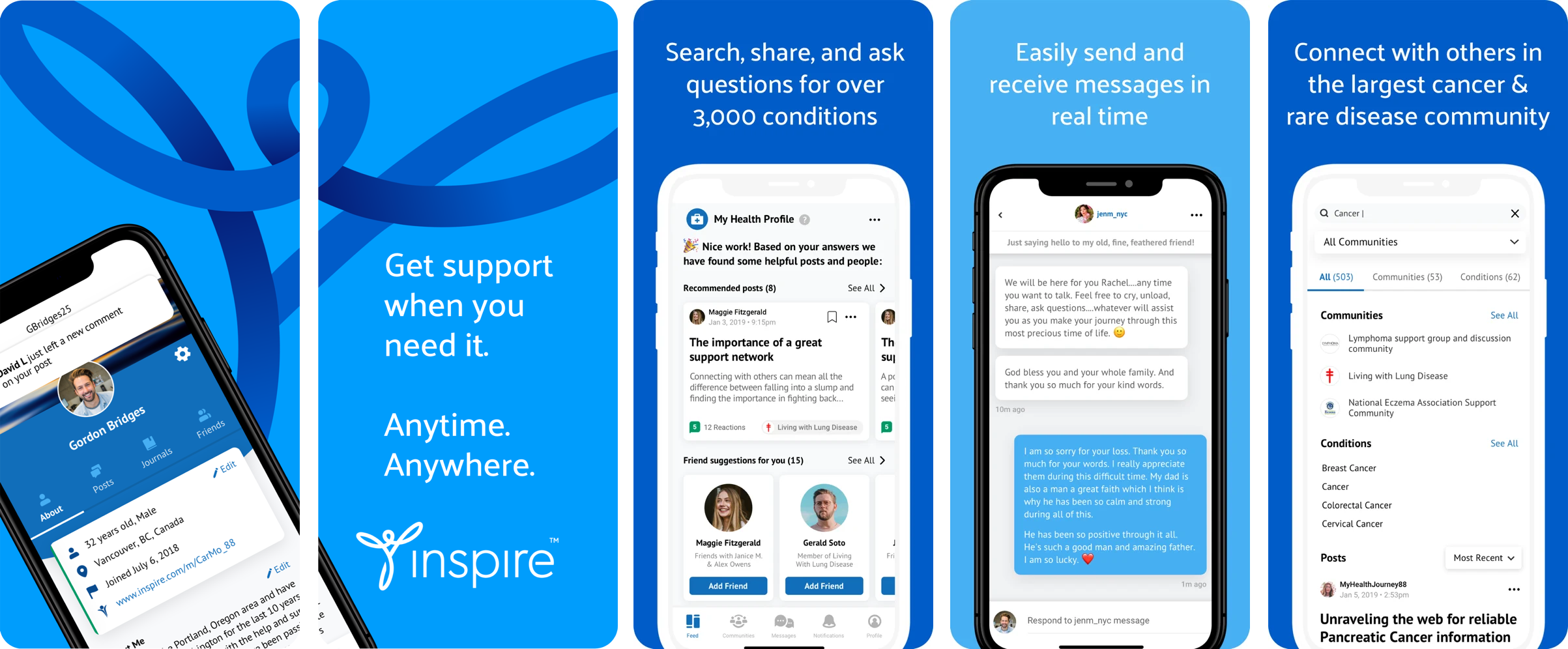
Inspire App
Company: Inspre | Project: Inspire App | 2020
My Role: Design direction
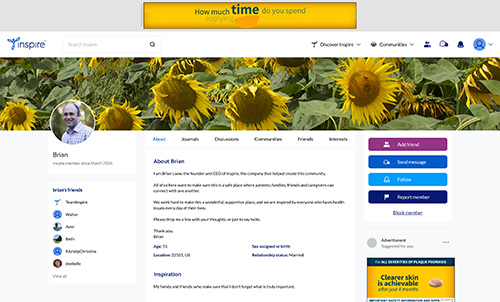
Summary: I led the effort to modernize the functionality of Inspire by working with a leading app design and programming firm to create a user-friendly and visually appealing iPhone app. Our efforts resulted in a highly rated 4.8-star app, the highest in its category on iTunes.
The Challenge
Inspire's members needed a seamless and intuitive way to interact with the platform from their iPhones. The challenge was to retain all existing functionality while improving the user experience and making the app's design and interface modern and appealing.
The Solution
As a design lead at a growing tech company, the product manager, the project manager, and I were tasked with modernizing the functionality of our platform, Inspire, for members who were increasingly using their iPhones to interact with the product. The challenge was to retain all existing features while also improving the user experience and making the app's design more visually appealing.
To get started, we oversaw in-house UX research to determine the key components of the app and conceptualize its design. With limited resources and a small in-house design team, I realized that we needed to bring in an expert in app design and interaction to bring our vision to life.
After searching for the right firm, we went with a firm who had a track record of delivering top-rated apps. Regular meetings were held with the product manager, project manager, app firm, and I to provide feedback on initial sketches and wireframes, eventually moving on to full-color UI design.
My role was to ensure that the UX/UI design met our brand standards and to provide feedback on how to further enhance the user experience. I worked closely with the app design firm to ensure that the app was user-friendly and visually appealing, making sure that the design met the needs of our members.
As the app took shape, I was thrilled to see the positive impact that thoughtful and well-executed design was having on the overall user experience.
The Result
Our efforts paid off as the app received outstanding feedback from members, earning a 4.8 out of 5 stars on iTunes, putting it at the top of its category. Overall, the success of this project demonstrated the impact of having a dedicated design lead and the value of our decision in bringing in an expert in app design and interaction. The app not only met the needs of our members but also set a new standard for the industry, showcasing the power of great design and user experience.
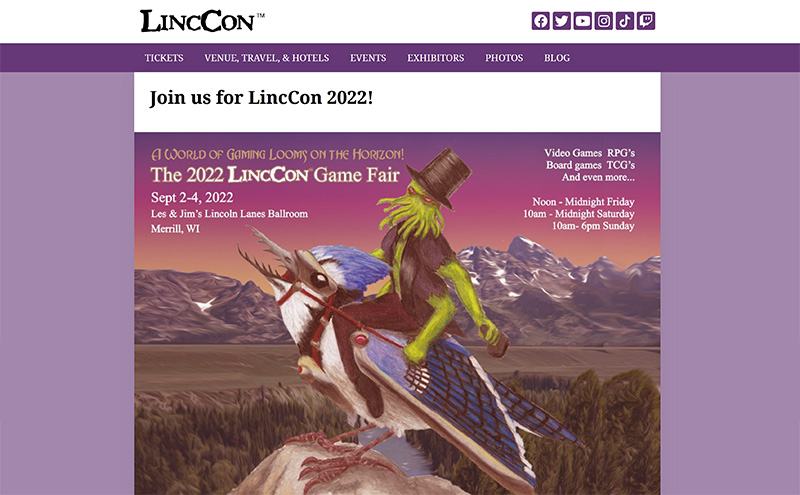
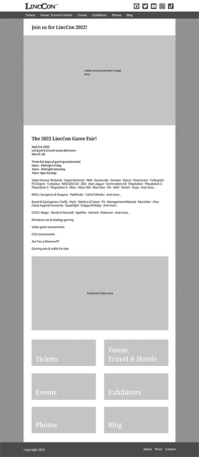
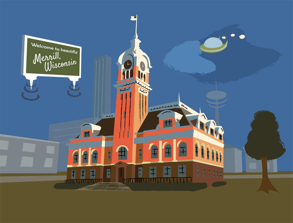
LincCon Website
Company: LincCon Game Convention | Project: Redesign website and implement CMS | 2022
My Role: Design thinking, project management, marketing consulting
Summary: I used design thinking to create a really usable website for LincCon, creating it in Wordpress for ease of updating, and then provided training and further ephemera for LincCon staff.
The Challenge
A central Wisconsin game and science fiction convention, LincCon, has been growing quickly, and needed a website that could grow with it.
My Solution
I knew that this was a perfect choice for using the entire design thinking process. I spoke extensively with the head of the convention, and we decided that a CMS would be ideal, and given the simplicity that Wordpress would be the easiest solution for upkeep. I then went to major convention websites - Gencon, Comic-Con, Dragon Con.
I took notes on what worked, what didn't work, what was confusing, and what would make sense for the LincCon site. I also made note of the social networks that LincCon didn't have a presence on yet, and I advised the convention leadership on adding the missing networks and what kind of content they should include.
Next, I started by creating several sketches, then going through them and picking out the best parts, then another set of sketches based on that. Based on these I was able to narrow down how it should look, taking into account that it would need to change every year to match the theme. I went with a two color palette, with one main color and one accent color, to be taken from the year's theme.
Having all this in line, I used Figma to create a UX wireframe of the homepage of the site. The convention leadership and I went over it, to make sure it had everything they needed and made sense. I had already designed the poster for this year's event, based on old pulp sci-fi art. Since this logo/theme changes every year, it would set the color profile. The rest of the information also changes every year or more regularly, but the overall content remains of the same type. A couple of tweaks were made, and I was then able to proceed to the full color UI design.
Once the pieces were filled in, I built the site using Elementor and Wordpress and launched it live, and provided training to the head of the convention on how to update it and create blog posts.
The Result
The ease of use for posting and updates has helped the LincCon staff communicate better with convention goers, and the look and feel being easily updated to match the year's theme will be very useful. You can see more and ephemera on my Behance profile, www.behance.net/gizmo4223
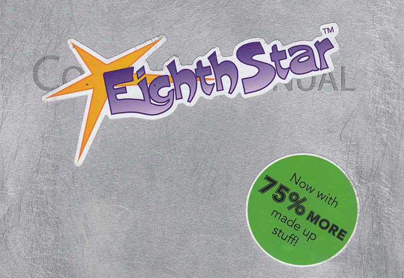
Eighth Star Tabletop RPG
Project: Create Core Rulebook for Eighth Star Tabletop RPG | 2022
My Role: Design direction, project management, design, illustration, product ownership
Summary: Through years of work I created an entire product, from game mechanics and explanatory text through illustration and layout.
The Challenge
I had many ideas for a role playing game system, including a universe for it to exist in, but I needed to put it in a form where others could see and play it. The universe had been developing over a large number of years, but it needed quality illustrations to make it come to life.
My Solution
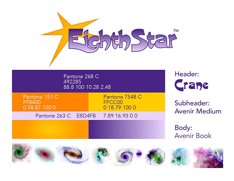
I started by writing the text of the game and developing the game mechanics. Once the first draft was done, I broke down the remaining work. There was branding, design layout, illustration, testing, trademarking, publishing, and marketing; I also decided to concurrently develop an app that would simplify some of the more complex game mechanics around space travel.
The first thing that was necessary was deciding on the branding. I had a title for the game, but I worked through the design thinking process and iterated until I had a logo, colors, fonts, and a basic visual style that really conveyed the essence of the game. This meant fun, bright colors that we more vibrant than real life.
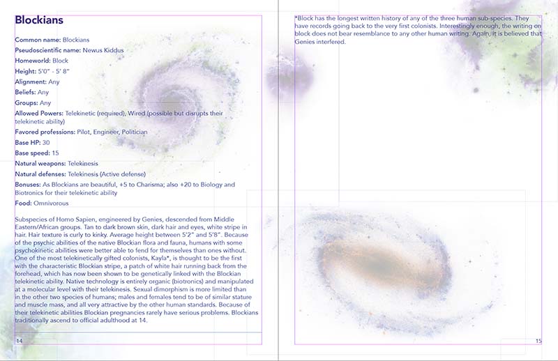
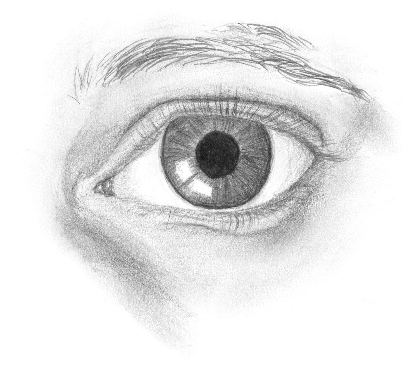
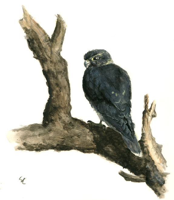
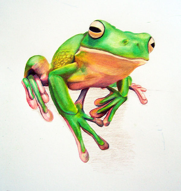
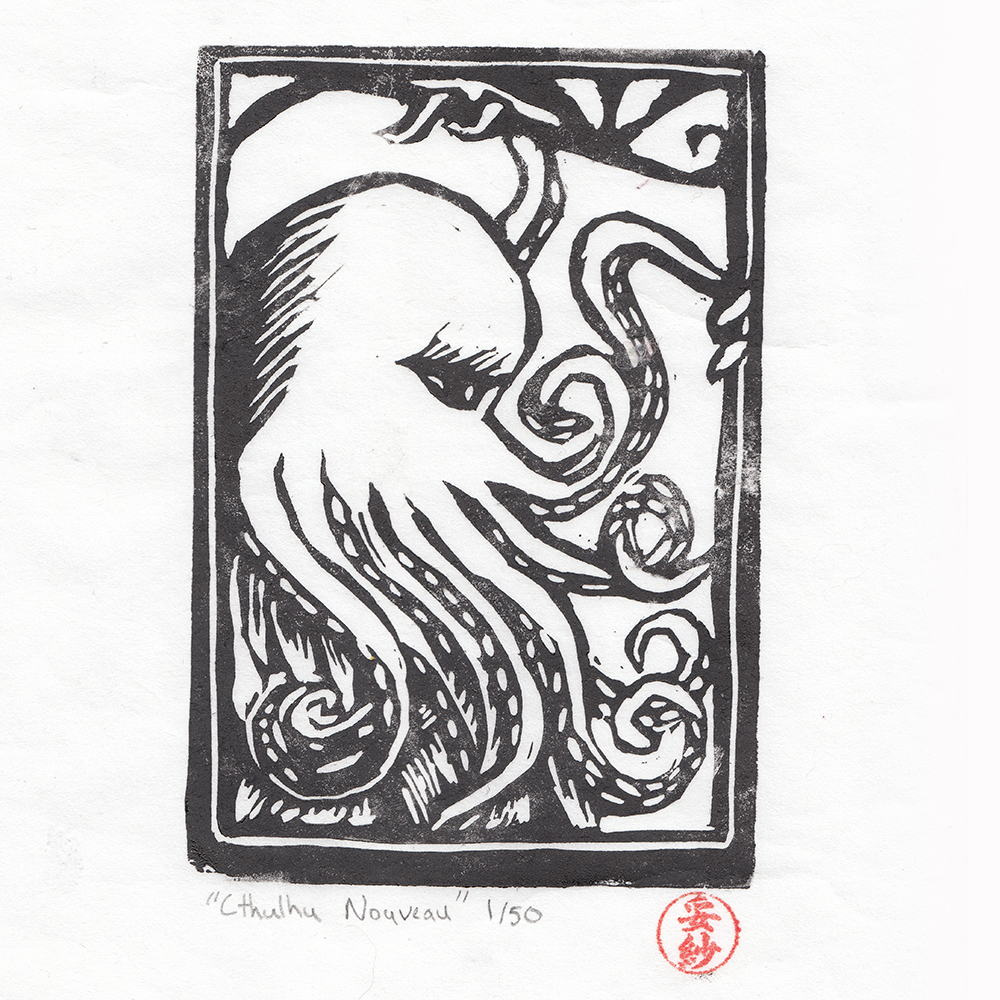
Once the basic branding was set, I was able to start on the layouts. I used the brand essence images, fonts, and colors extensively, and left room for the future illustrations that would be necessary to really explain everything visually, ending up with a document that is several hundred pages. As I did this, I made an extensive list of the illustrations I would need; what they were of and a written explanation of what the illustration should look like an convey.
I then took the list and began creating illustrations so that people could immerse themselves in the world. I prioritized the illustrations by if they were necessary to playing the game (i.e. illustrations of what characters could look like, and layouts of things that would exist in the game world like ships) and illustrations that were just for illustrative purposes.
While creating the illustrations I began distributing the early version for play testing. For the first few rounds I relied on informal feedback, but for the later rounds I've created a feedback form to be filled out. I'm rewarding testers with a free PDF of the final version when it comes out, and a discount on the print version. I've also started the trademarking process and looked at different publishing avenues and publishers and what their marketing tools will allow me to do.
The Result
While an incredibly large project, this has brought me immense satisfaction as the final product will be the culmination of many years worth of work, and really lets my abilities as a designer, illustrator, and design director shine.